How do we ensure that an established institution’s vision and mission are kept and communicated well in a brand refresh?
Build the vision as part of the infrastructure.
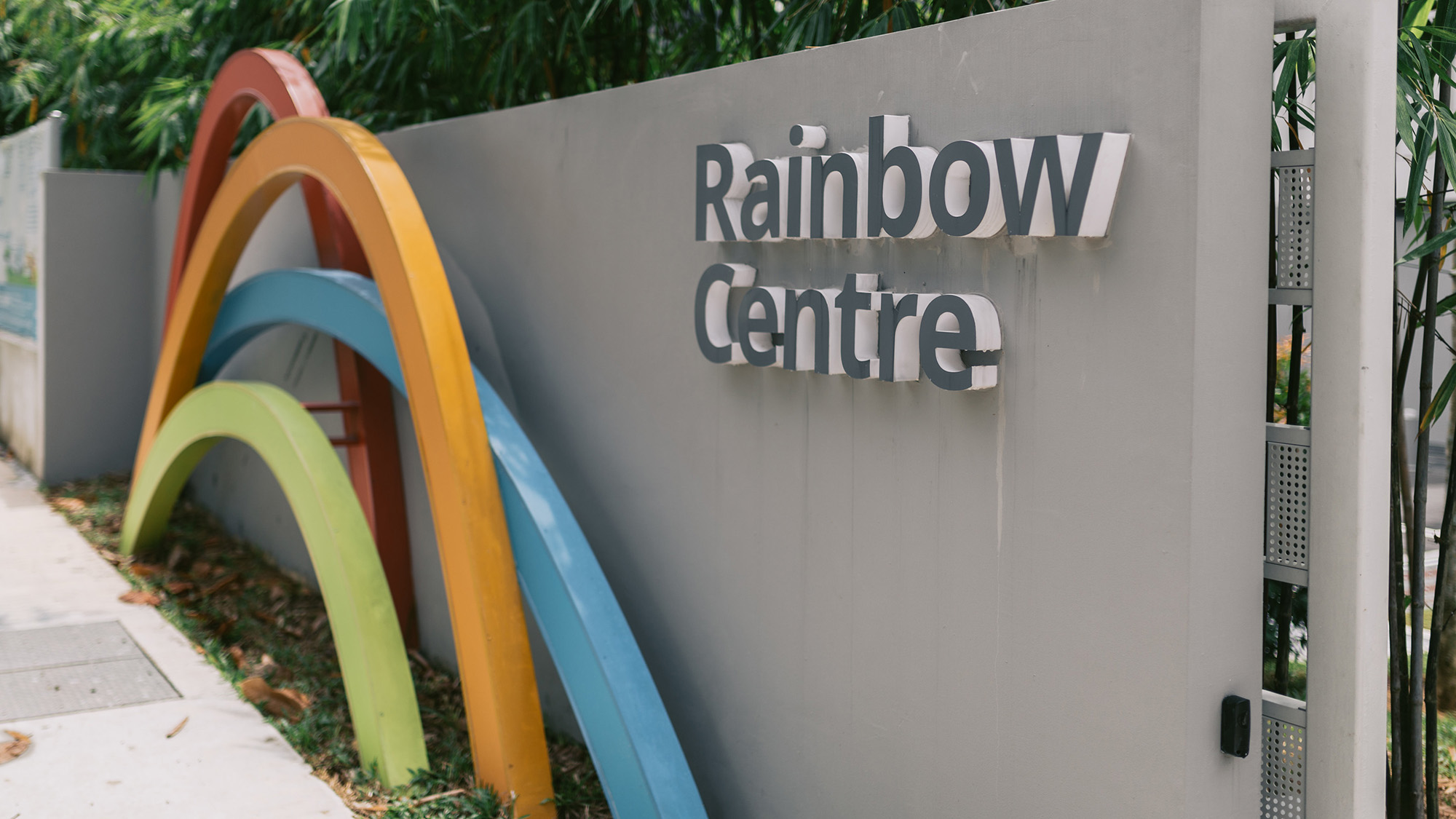
Rainbow Centre envisions a world where people with disabilities are empowered and thriving in inclusive communities. As part of their 30th anniversary celebrations, they commissioned us to execute a brand refresh that incorporated their vision and mission into the physical space.
Branding
Rainbow Centre’s brand refresh celebrates its core belief of ‘people first, impediment second’. The new logo features vibrant colours and diverse shapes that come together to form a rainbow, symbolising the unique paths taken by each student and the hope they foster. A woodcut tree centrepiece was built to represent growth. Whilst encouraging exploratory and social play, the open structure allows for easy student supervision.
To help students, staff and stakeholders experience the centre’s vision, the space, uniforms and marketing materials were designed to reflect the refreshed visual identity, creating a cohesive and inspiring environment.
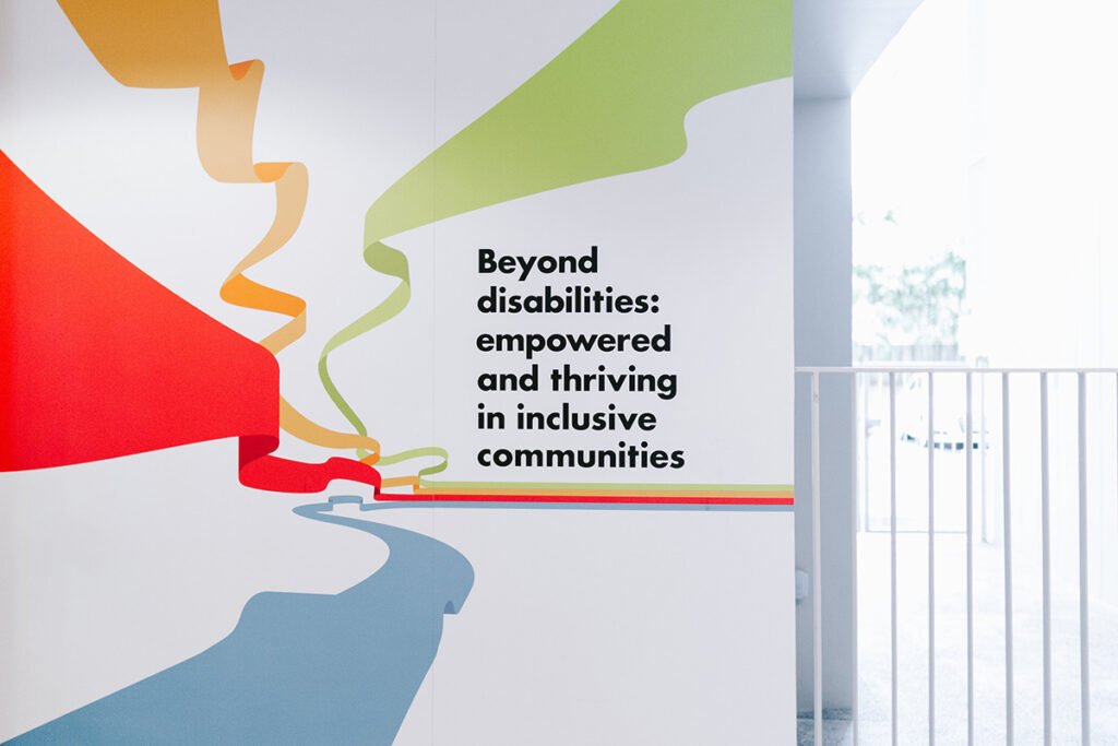
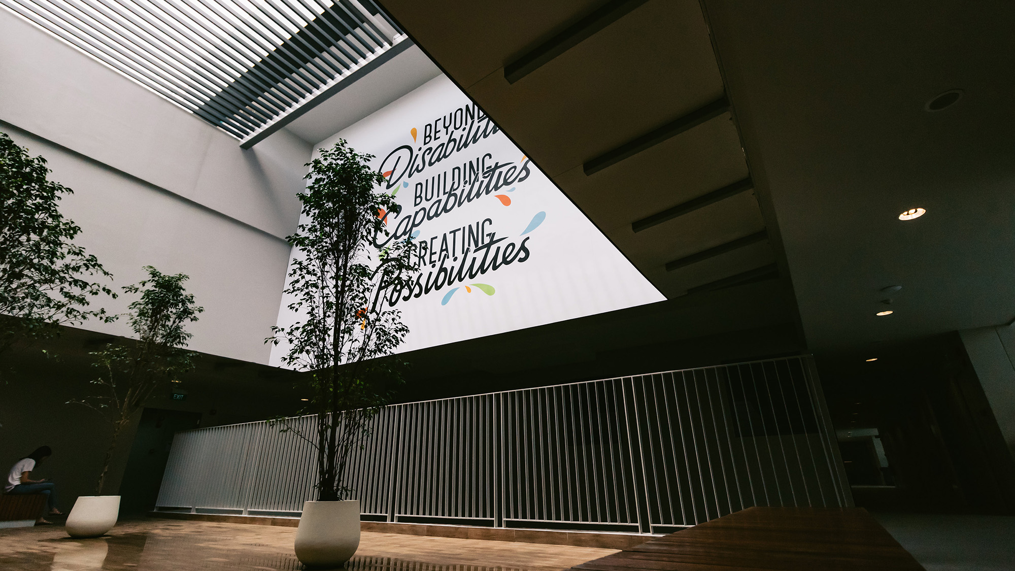
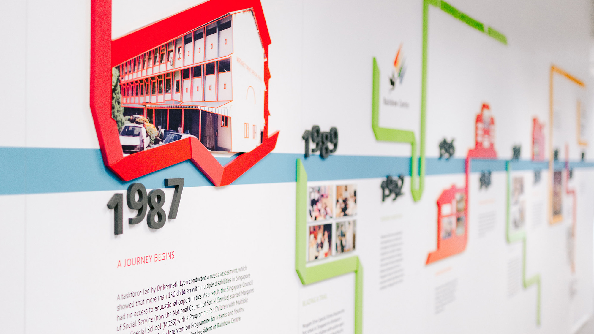
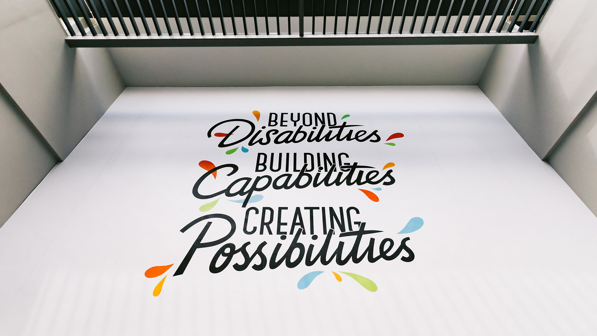
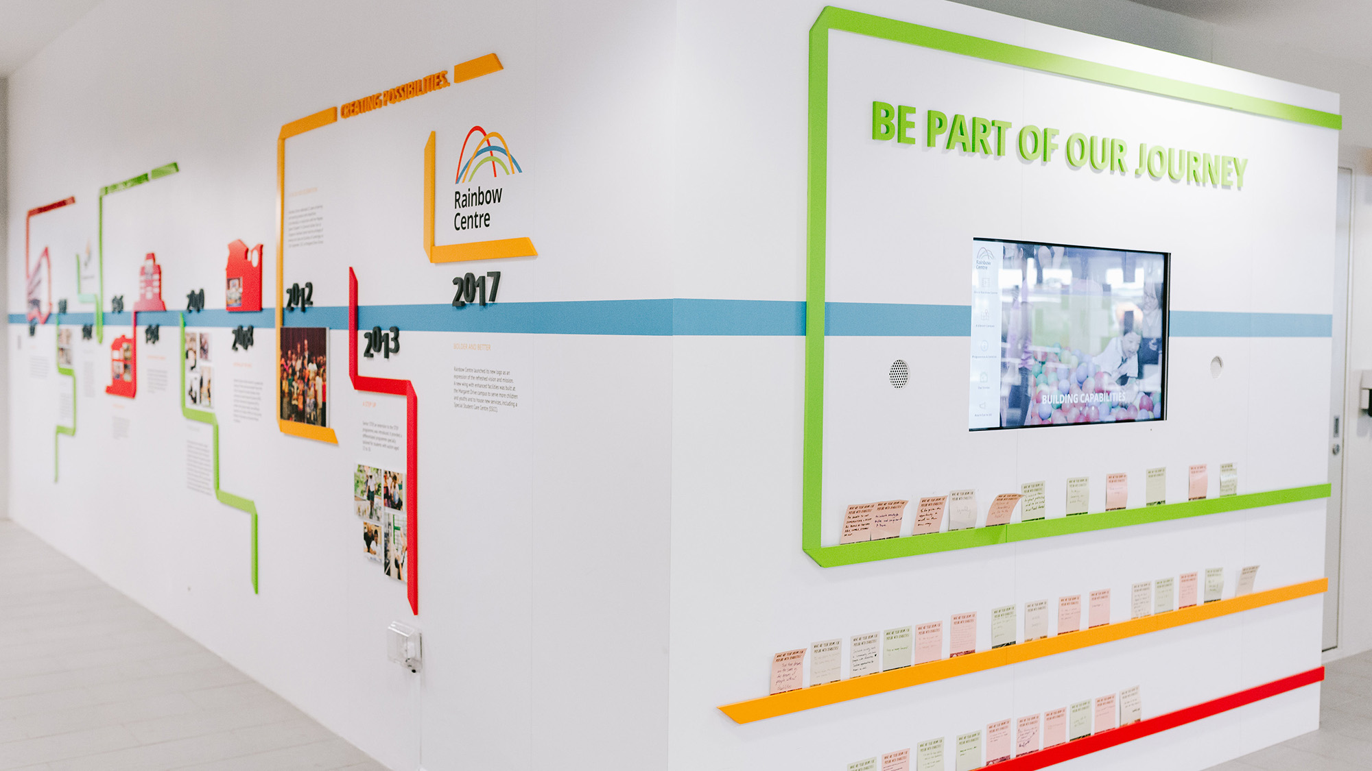
Space messaging
The refreshed brand was brought to life through the design of feature walls at their new extension wing at Margaret Drive.
Logo design
A logo based on a narrative called “Paths” was designed to explain the meaning behind the brand.
Play Video
Collateral design
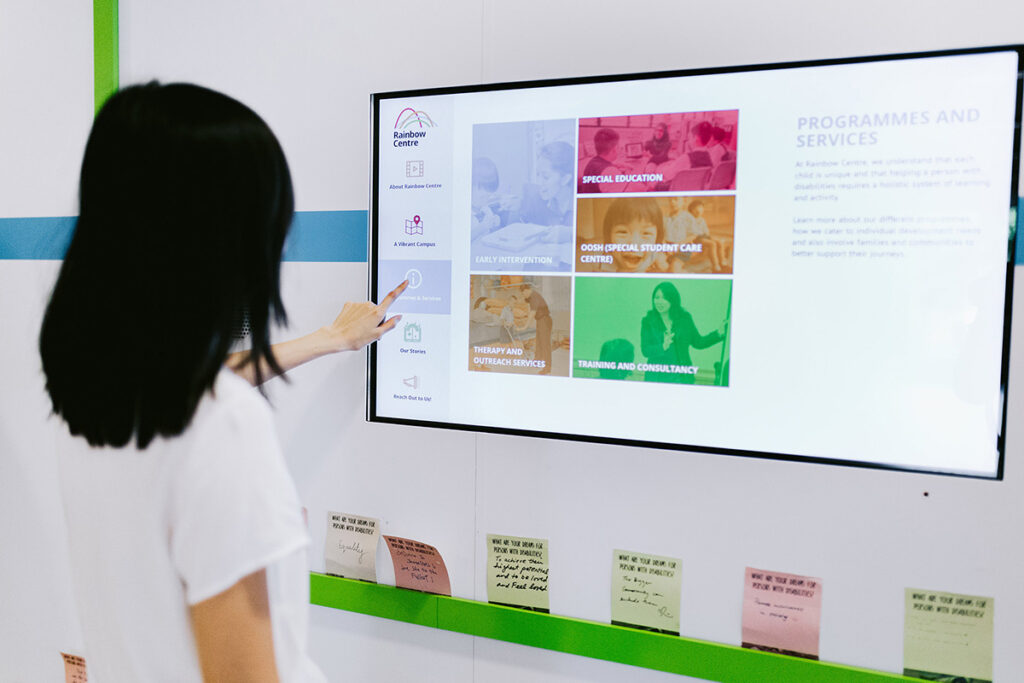
To help the centre’s staff, students and stakeholders engage with their vision, we created multiple interactive experiences to weave their aspirations into the Centre’s infrastructure. This includes an interactive screen that allows visitors to find out more about Rainbow Centre.